Seven Quiet Errors That Shrink a Living Room — and the Corrections That Open It Back Up
Photo: F. A. McDaniels, photographer, Public domain, via Wikimedia Commons
Square footage rarely tells the whole story. Two living rooms of identical dimensions can feel dramatically different — one expansive and breathable, the other cramped and airless — and the difference almost always comes down to a handful of correctable decisions. Spatial perception is not fixed; it is designed.
Below are the seven errors we encounter most frequently in American living rooms, along with the specific correction for each.
Mistake 1: The Rug That's Too Small
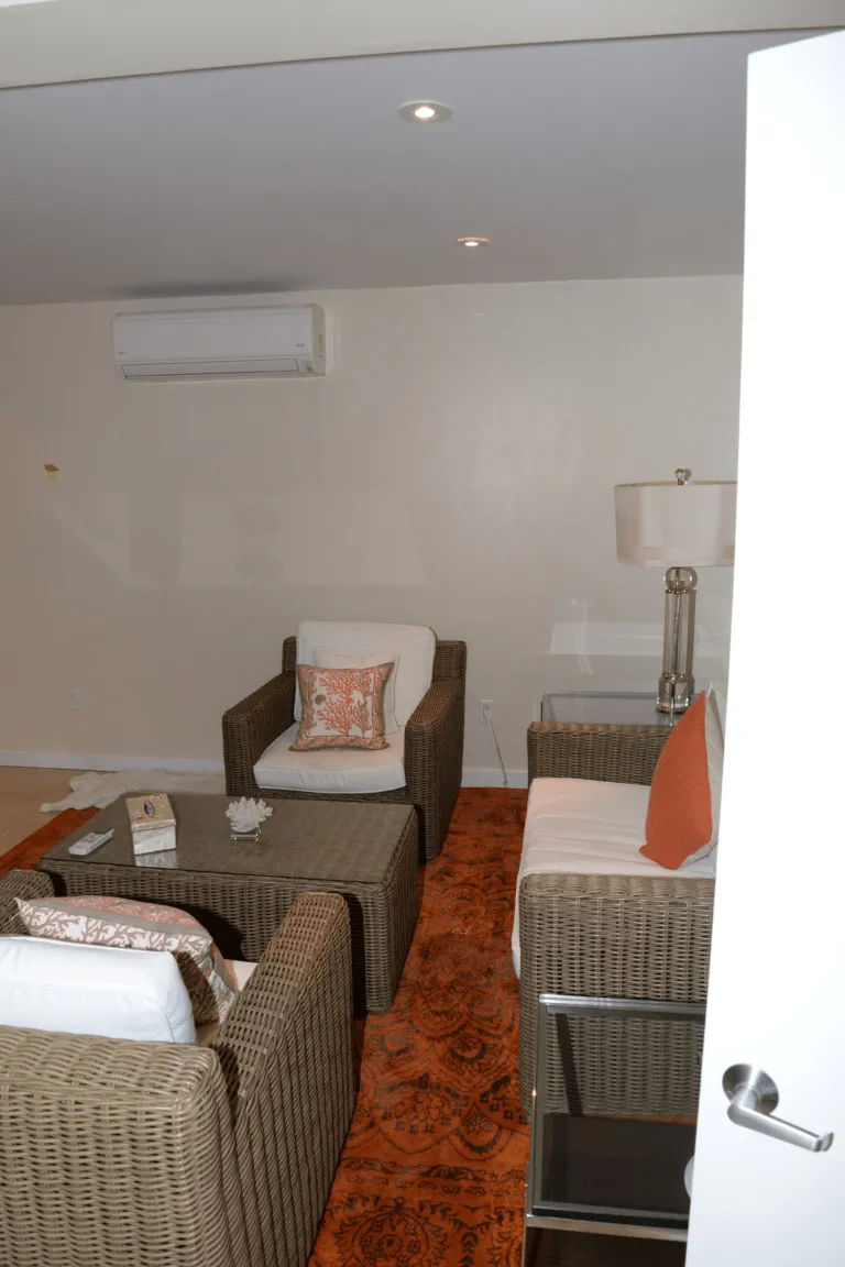
An undersized rug is the single most common error we see. A five-by-eight rug floating under nothing makes a seating group read as a collection of disconnected islands — and the floor around it dominates the eye.
The fix: Size up. In a typical American living room, a nine-by-twelve rug allows at least the front legs of every piece in the seating group to rest on it. The rug should anchor the entire conversation area, unifying it into one deliberate zone.
Mistake 2: Furniture in a Wall-Hugging Lineup
Pushing every sofa and armchair against the perimeter seems like a space-saving move. In practice, it does the opposite: it empties the center of the room and forces conversation across an awkward, cavernous middle.
The fix: Pull seating inward, even by twelve to eighteen inches. A sofa floated off the wall with a console behind it creates circulation paths and makes the room feel intentional rather than staged for a moving truck.
Mistake 3: Lighting from a Single Ceiling Fixture
One overhead light casts a flat, shadowy wash that compresses corners and flattens texture. Rooms lit from a single point above genuinely read as smaller.
The fix: Build three layers — ambient, task, and accent. A pair of table lamps at seated eye level, a floor lamp in a dark corner, and a picture light or sconce will lift the visual ceiling and pull the eye into every part of the room.
Mistake 4: Cluttered Sightlines
Every object between the doorway and the far window interrupts the eye's travel. When sightlines are blocked, the brain registers the room as shorter and shallower than it is.
The fix: Stand at your main entry and look across the room. Clear that diagonal. Relocate the plant, the oversized cabinet, the stack of baskets. A single unobstructed diagonal view can add perceived depth of several feet.
Mistake 5: Furniture Scaled for a Larger Room
An oversized section in a modest room consumes the floor plane; a petite loveseat in a grand room makes everything around it feel diminished and chaotic.
The fix: Match furniture mass to room volume. In smaller rooms, choose a sofa with exposed legs and a lower back, which lets light and sight travel beneath and over it. Measure before buying — depth matters as much as length.
Mistake 6: Heavy Window Treatments Hung Too Low
Curtain rods mounted just above the window frame chop the wall into a low, squat band and visually cap the ceiling.
The fix: Mount the rod six to twelve inches above the window frame — or nearly to the ceiling line — and extend it several inches beyond the window on each side. Panels that hang from a high, wide rod make both the window and the wall read as larger.
Mistake 7: Everything One Tone, One Height
A room where every piece sits at the same height and every surface is the same color lacks the visual variation that gives a space dimension. Flatness reads as smallness.
The fix: Introduce vertical rhythm — a tall bookcase beside a low console, a floor lamp beside a chair — and vary your palette in tone rather than intensity. Layered neutrals with differing values add depth without adding visual noise.
The Common Thread
Notice that none of these corrections involve construction, renovation, or even significant expense. Most require rearrangement, rehanging, and relighting — the quiet instruments of spatial design. A living room feels as large as your choices allow it to feel. Choose generously.