Painting With Perception: How Color Psychology Can Transform Your Compact Living Space
Photo: Roger W from Sarasota, Florida, U.S.A., CC BY-SA 2.0, via Wikimedia Commons
Living in a compact home — whether a 400-square-foot studio in Chicago or a narrow row house in Philadelphia — often presents a fundamental tension: how do you create a space that feels both beautiful and breathable when every square foot is accounted for? The answer, increasingly supported by environmental psychology research, lies not in square footage itself, but in the colors that surround you.
At Decor Design Studio, we believe that a well-designed space begins with understanding how the human mind processes visual information. Color is not decoration in isolation — it is a language that communicates scale, warmth, movement, and mood before a single piece of furniture is arranged.
The Science Behind How Color Alters Spatial Perception
Researchers in environmental psychology have long established that color wavelengths directly influence how we perceive depth and dimension. Cool hues — soft blues, muted greens, and silvery grays — recede visually, creating the impression that walls are farther away than they actually are. Warm tones, by contrast, advance toward the eye, making surfaces feel closer and more intimate.
A 2019 study published in the journal Color Research & Application found that participants consistently rated rooms painted in cool, light-reflective tones as significantly larger than identically sized rooms painted in saturated, warm colors. This is not a subjective preference — it is a measurable cognitive response rooted in how our visual cortex processes light and distance.
For small-space dwellers, this research carries immediate practical value. Choosing a wall color is not simply an aesthetic exercise; it is a spatial decision with real consequences for how a room feels to inhabit daily.
Strategic Palette Selection: Where to Begin
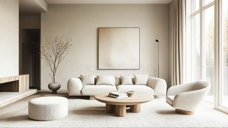
One of the most common mistakes homeowners make in compact spaces is defaulting to stark white under the assumption that it maximizes brightness. While white does reflect light effectively, it can also create a clinical, unfinished quality that makes a space feel sparse rather than serene. The more sophisticated approach involves selecting what designers often call "warm whites" or "off-whites" — tones like Benjamin Moore's "White Dove" or Sherwin-Williams' "Alabaster" — which carry subtle undertones of cream or gray that lend warmth without enclosing the room.
For those willing to move beyond neutrals, soft sage greens and dusty blue-greens have emerged as particularly powerful choices for small living areas. These hues carry natural associations with open outdoor environments, which psychologically extends the perceived boundary of interior walls. Paired with natural wood tones and linen textiles, they create a layered, organic palette that feels both curated and calming.
The Accent Wall Reconsidered
For years, the accent wall was the go-to solution for adding visual interest to a small room. However, contemporary design thinking — and the spatial science that supports it — suggests a more nuanced application. Rather than painting a single bold wall in a contrasting color, consider a technique called "color drenching," in which the walls, ceiling, and trim are all painted in the same hue or closely related tones.
This approach, championed by designers including Farrow & Ball's creative team, eliminates the visual interruptions that make a room feel segmented and small. When the eye has no hard boundary to register, the brain interprets the space as more continuous — and therefore larger. Case studies from residential projects in New York City's Upper West Side and San Francisco's Mission District have demonstrated that color-drenched rooms in deep teal or slate blue can feel dramatically more spacious than their white-walled counterparts, despite identical floor plans.
Lighting as Color's Essential Partner
No discussion of color in small spaces is complete without addressing light — both natural and artificial. The same paint color will read entirely differently depending on the quality, direction, and temperature of light in a room. A cool gray that appears crisp and airy in a south-facing room can feel oppressive and dim in a north-facing one.
At Decor Design Studio, we consistently advise clients to test paint samples at multiple times of day before committing to a full application. Beyond paint selection, the color temperature of artificial lighting profoundly shapes spatial perception. Warm-white bulbs (2700K–3000K) enhance the richness of earthy and neutral palettes, while cool-white bulbs (4000K and above) complement contemporary, cool-toned schemes and reinforce the perception of height and openness.
Mirrors, strategically placed to reflect natural light sources, function as a secondary tool that amplifies whatever color palette you have chosen. A well-positioned mirror in a narrow hallway painted in soft greige can visually double the apparent depth of the space.
Real Transformations: Case Studies in Small-Space Color
Brooklyn Studio, 385 Square Feet: A young professional approached our studio with a single-room apartment that felt cramped despite its south-facing windows. The previous tenant had painted the walls a saturated terracotta, which, while visually striking, created a cave-like atmosphere. Our recommendation: a full color-drench in Farrow & Ball's "Mizzle," a warm, muted green-gray that harmonized with the natural light. The transformation was immediate — the room felt as though it had gained several feet in every direction, and the client reported a measurable improvement in her daily sense of calm.
Philadelphia Rowhouse, First Floor, 420 Square Feet: A couple sought to unify a choppy, compartmentalized first floor that included a kitchen, dining nook, and sitting area. We proposed a continuous palette of soft warm white on the walls with contrasting dark navy on the lower kitchen cabinetry, grounding the space while drawing the eye upward. The ceiling, painted in a barely-there sky blue, added a sense of elevation that made the 8-foot ceilings feel considerably taller.
Actionable Palettes You Can Implement Today
For those ready to begin, here are three cohesive palettes designed specifically for small American homes:
Palette 1 — The Serene Studio: Walls in Sherwin-Williams "Rainwashed" (soft aqua-green), trim in "Alabaster," accents in natural rattan and warm brass. Best for: studios and open-plan apartments with good natural light.
Palette 2 — The Grounded Urban Flat: Walls in Benjamin Moore "Pale Oak," cabinetry or built-ins in "Wrought Iron," textiles in oatmeal and charcoal. Best for: narrow city apartments seeking a sophisticated, editorial feel.
Palette 3 — The Warm Minimalist: Full color-drench in Farrow & Ball "Elephant's Breath" (warm gray), white oak furniture, terracotta ceramic accents. Best for: north-facing rooms needing warmth without heaviness.
Designing With Intention
The underlying principle that guides every small-space color consultation at Decor Design Studio is this: great design begins with understanding how people experience space emotionally, not just visually. Color is one of the most powerful and accessible tools available to any homeowner, regardless of budget or square footage.
When chosen with knowledge and intention, the right palette does not merely decorate a room — it reshapes it, making 400 square feet feel not like a limitation, but like a carefully crafted world of your own.